


[email protected]
+852 3678 8700
Or use our enquiry form
702, LKF 29
29 Wyndham Street
Central, Hong Kong
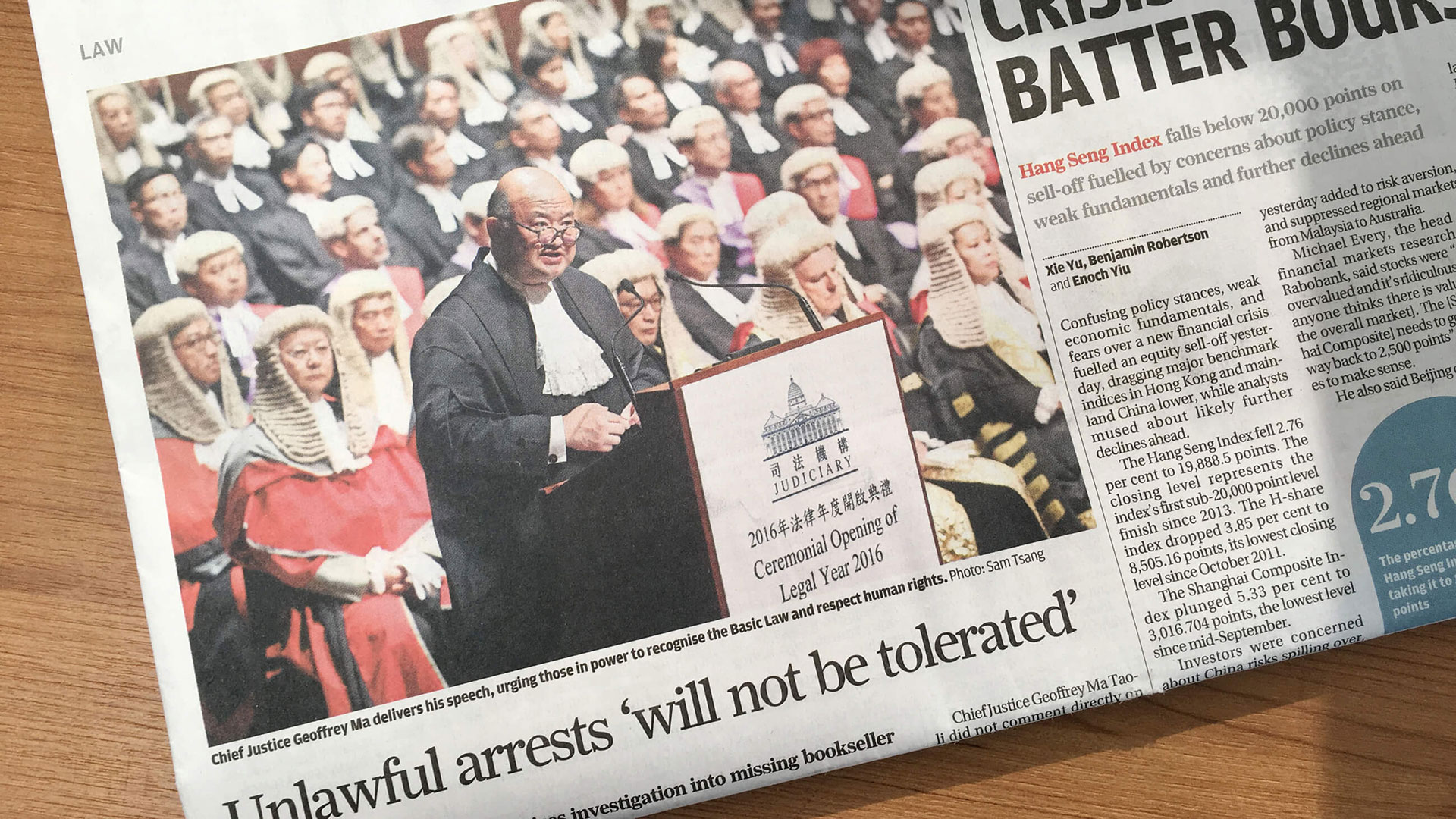
The Judiciary of the Hong Kong Special Administrative Region of the People’s Republic of China is responsible for the administration of justice in the city. It is constitutionally independent of the executive Government and the Legislature.
The Judiciary assigned Stepworks to assist them with developing a new logo and brand identity system.
The institution launched the initiative with the belief that the Judiciary logo will help members of the public to distinguish the Judiciary from the executive arm of the Government. This distinction underlines the independence of the Judiciary.

Successful outcome – After exploring many options, the carefully managed project culminated in a new logo for the Judiciary.
Wide acceptance – Displayed in every courtroom and point of public interaction, the logo is widely recognised as a symbol of justice.
.jpg)
“The logo in blue displays solemnity and dignity, representing the Judiciary’s core value of administering open and impartial justice.”
From the logo launch press release
Judiciary of the Hong Kong Special Administrative Region of the People’s Republic of China
Just as a society benefits from laws and guidance, so does a brand.
The Hong Kong Judiciary’s new logo was launched with a set of guidelines mandating its use, and describing in detail how it must be applied.
The Judiciary logo depicts the Court of Final Appeal. The building is a fine symbol. Its neo-classical architecture, Ionic columns and dome speak of stability and strength. The historic facade conveys the majesty of the law and reflects the Judiciary’s common law heritage.
The equal weight of the Chinese and English logotypes, a dignified blue colour and the classic serif typeface represent in good faith the traditions of an impartial, independent and steadfast institution.
Clear guidelines – Government designers and contractors are able to easily apply the logo at every relevant location
Professional image – The Judiciary’s corporate approach to the design project reflects the institution’s commitment to process and attention to detail.


[email protected]
+852 3678 8700
Or use our enquiry form
702, LKF 29
29 Wyndham Street
Central, Hong Kong